Linear calendar vs grid calendar: which one actually works?
I used to think my problem with planning was a lack of discipline. I would open my calendar app, look at a crowded monthly grid, and feel a strange sense of claustrophobia. In that first moment of comparing a linear calendar vs grid calendar, the claustrophobia of the grid becomes immediately apparent. The boxes were small, the text was truncated, and every time Sunday rolled around, the visual flow of my life just... snapped. I had to jump my eyes back to the left side of the screen to start a new row. It felt like reading a book where the pages were cut into random strips and glued back together.
Then I started experimenting with a linear view. Instead of the traditional 7x5 matrix, I looked at time as a continuous, unbroken line. It sounds like a small design tweak, but the shift in perspective is massive. When you compare a linear calendar vs grid calendar, you aren't just choosing a different UI. You are choosing between managing your chores and actually planning your life.
The grid trap
Most of us use grid calendars because that is what we were given. From the paper planners in middle school to the default view on Google Calendar, the grid is the standard. It works well for one specific thing: knowing what you are doing at 2:00 PM on a Tuesday.
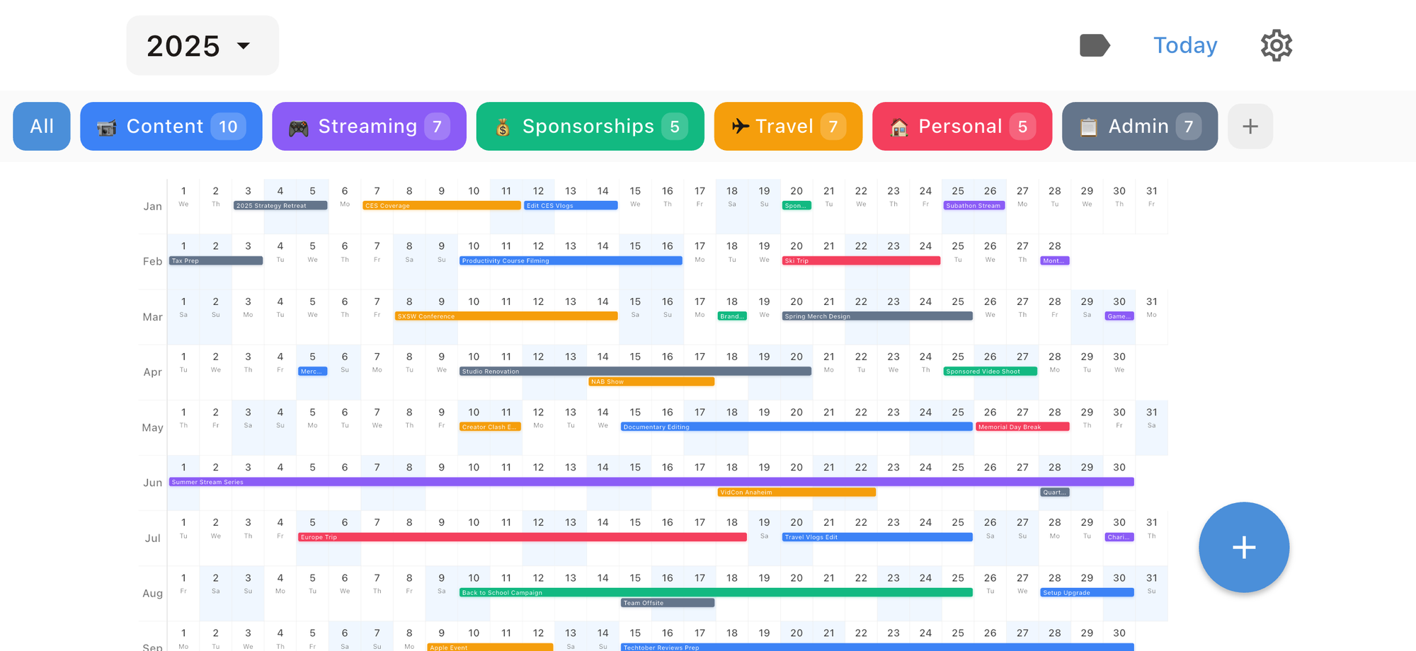
But grids have a fundamental flaw. They chop time into disconnected chunks. By forcing every month into a square, they create artificial barriers. If you have a project that starts on the 25th and ends on the 5th of the next month, that span is visually severed. You can't see the momentum.
In my experience, grids also lead to a specific kind of overbooking. Because you only see four weeks at a time, it is easy to say yes to three major commitments in October without realizing you already have four scheduled for early November. The "cliff" at the end of the month hides the upcoming burnout. Research actually supports this; studies show that grid layouts often hinder our ability to detect long-term patterns compared to linear charts.
Why the linear calendar vs grid calendar debate matters
Time is a river, not a chest of drawers. A linear calendar treats it that way. Whether it is a horizontal timeline or a vertical list, a linear view allows your eyes to track the flow of events without the "typewriter return" motion required by a grid.
In a 2019 study involving 92 participants, researchers found that linear bar charts were significantly more accurate and efficient for users trying to interpret daily patterns. People just "get" lines better than they get matrices. This is even true in early education. Preschools that use linear calendars—basically a long number line of days—report that children understand the concept of "three days from now" much faster than they do on a standard wall calendar.
For those of us trying to manage a career and a personal life, that clarity translates to better energy management. When I look at a linear year view, I can see the "V-shaped" spikes where my work is hitting a peak. I can see that if I take a trip in June, I need to clear my schedule in late May to prepare. You don't get that from clicking through monthly tabs.
Comparing the tools
I have spent a lot of time jumping between apps to find the right balance. No tool is perfect, and most of them force you into one camp or the other.
Google and Apple Calendar
These are the kings of the grid. They are excellent for quick density scans. I can look at my week and instantly see where I have a free hour for lunch because the blocks are fixed. However, their monthly views are nearly useless for planning anything more complex than a dentist appointment.
Chronos
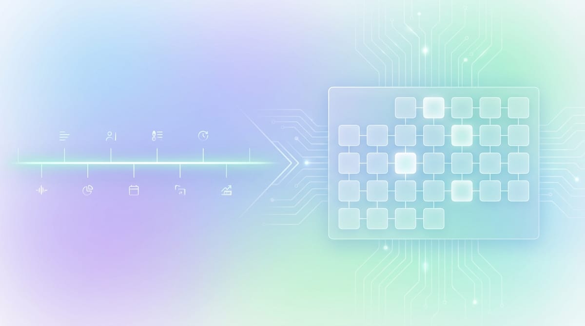
If you want to experience the benefits of a linear calendar vs grid calendar on your iPhone, Chronos is the solution I currently recommend. It provides a beautiful, year-at-a-glance linear view that lets you see your life as a continuous stream. It’s built for privacy—no accounts are needed, and it uses iCloud sync to keep your data between devices. It’s a refreshing change from the "boxed-in" feeling of standard apps.
The Nick Milo / Analog Method
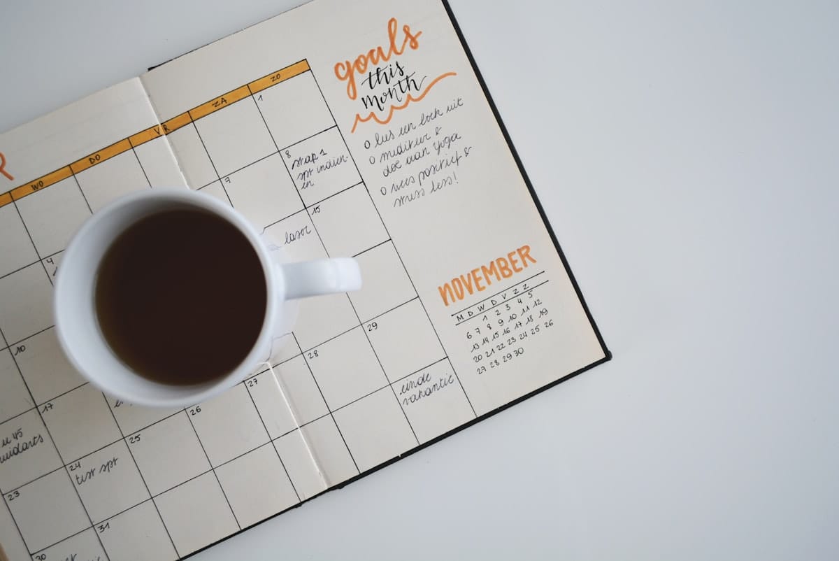
One of the most effective ways to use a linear calendar isn't even an app. Many productivity enthusiasts advocate for a single-page yearly linear view. Some people prefer a physical printout where you mark your big milestones, your vacations, and your "high-energy" periods. It is a map of your year that stays static.
How to choose based on your needs
You don't actually have to pick just one. I have found that a hybrid approach is the only way to stay sane.
If you are managing a team or a heavy meeting schedule, the grid is your friend for the "now." You need that fixed-time intuition to know how long a 30-minute meeting feels. But for your personal planning and your big goals, you need a line.
Here is how I suggest setting it up:
1. Use a grid for your daily and weekly execution. This is your "where do I need to be?" view.
2. Use a tool like Chronos to maintain a linear year view for your "what am I building?" perspective.
3. Once a week, look at the linear view to see if your upcoming grid is actually aligned with your long-term capacity.
The honesty check
I'll be honest: switching to a linear view won't magically give you more time. If you have too much on your plate, a different layout just makes the mess look more organized. But the linear view does something the grid can't: it makes the cost of your time visible.
When you see a six-week stretch of obligations as one continuous, unbroken bar of color, you feel the weight of it. You realize that you aren't just busy on "the 12th"—you are busy for a month and a half. That realization is usually what it takes to finally start saying no to things that don't matter.
Making the switch
If you want to try this, you don't need to spend hours building a custom spreadsheet. You can start by downloading Chronos on the iOS App Store. It’s available for a one-time purchase of $4.99/year or $14.99 for a lifetime license, making it a low-friction way to test the linear calendar vs grid calendar workflow for yourself.
Moving a box on a grid feels like a small chore. Moving a segment of a line feels like navigating. And that is what planning should actually be: navigation, not just filling boxes until the month is over.
See Your Year at a Glance
Experience the clarity of viewing your entire year in one beautiful interface. Download Chronos today.
Get the App